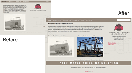
Schlosser Steel Buildings came to us with an existing web site and wanted to know about making updates, sprucing it up, and reorganizing the content. We started by converting the site from a standard HTML site to a content management system. We proceeded to fine-tune and build content. Then, we made the overall page wider to better fit today's larger wide-screens.

a. Case Studies, not Projects
Originally, all of the featured projects were contained under "Projects." Each project had a few pictures, and you would need to visit 5 or 6 different pages just to see all of the projects. During the site renovation, we changed "Projects" to "Case Studies." A slight tweak in the menu makes a big change in overall perception.

b. Tabbed Content
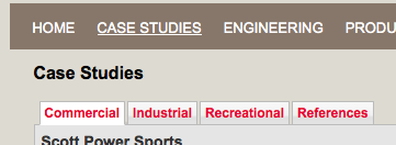
For the "Case Studies" and "Products" sections, we added a nifty feature called "AJAX Tabs" to help organize and present the content. These tabs allowed us to add lots of content without making you scroll 3 or 4 miles down the page to see it all. Nice!
c. Search & Site Map
Let's make it as easy as possible for people to navigate the site. For those who can't manage the newly simplified navigation menu, let's add a quick and easy site search function. Studies show that half of all web surfers use Search instead of menus - is your site this easy to navigate?

d. Client Login
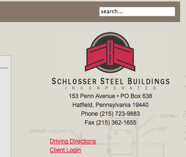
We also added a "Client Login" capability to the site. For starters, having a client login on your site will impress people. Even if it's not functional. However, the SS Buildings client login IS functional, and it's a great tool for collaborating with clients and partners - sharing files, information, and more. A small investment in your company's technology can improve productivity and deliver a great ROI.
View Site:
