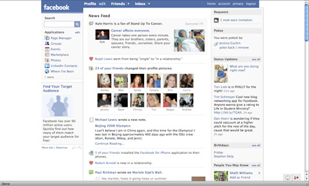
New Home Page
Lots of ajax tabs to let you browse, sort, and maneuver. The overall page is even wider, so less scrolling will be needed. Ad on the right, out of the way.
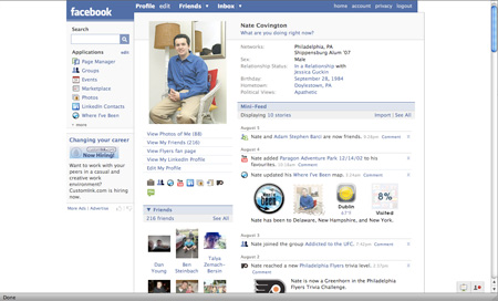
Old Profile
These pages were beginning to clutter, as Facebook allowed people to start putting 3rd party applications on their profiles. This is the part that was starting to look like MySpace, and I'm glad they got rid of this in the new version.

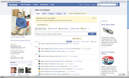
New Profile
Notice that there is now a tab that says "boxes" so that you can see the 3rd party applications - but only if you want to. This way, we're focusing on the actual content, not the distractions.

